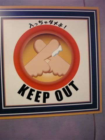
Take, for example, a simple "Keep Out" message. I suppose you could include something really frightening. Depending on who you wanted to keep out, you could include a monster, or a picture of someone being electrocuted, 43 pairs of K-mart Polyesther pants or whatever.
I spotted one a little while ago that had a really nice subtle touch.

See it?
Yeah... I wouldn't go in there either.... no matter how much fun they say "milking the prostate" is.


No comments:
Post a Comment